There are many things I have learned through working on this blog. It has taught me that I need to try to handle each task, one at a time, make sure I understand what I am doing and more importantly, WHY I am doing it.
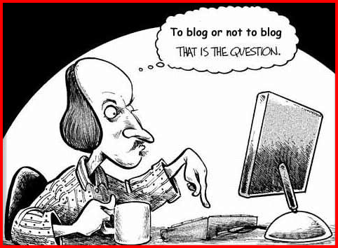
All the while, to me blogging is just a place where individuals can vent their personal feelings to the public but I guess, from today onwards, it has proved me wrong. I am not new to this blogging world as I have been maintaining my own personal blog for more than 5 years now. Looking back at my experiences when working on this weblog assignment has somehow changed my views on blogging. I have never come to know that there is so much more to the word 'blogging' and it is not only popular for teenagers and young adults, but also, to the older generation who wants to share their opinions and learn more things.
Blogs are great tool for teaching and learning and to exchange ideas and opinions. However, a blog needs to have a core focus and targeted to a specific audience. A blog can be seen as a tool that document the information inquiry process which allows us to develop broad opinions of the issues at hand.
Last but not least, I have learn that blogging requires a huge amount of ethics as it determines the acceptance of the weblog among the public. Sensitive issues should be handled wisely to avoid misunderstandings. It is the bloggers' responsibility to take appropriate measures n designing and publishing a blog.

Image Source : Screencast
